Since we released Trackier 2.0, the team worked really hard to bring in more features. Lucky for you, we have summarised everything inside this article. There we go:
UI/UX for Trackier
We’ve conducted extensive usability tests for each and every change, and learned a lot in the process.
Trust me when I say that usability tests are super-important in knowing what changes you make are for the better. You can always start with testing your product with your own employees/colleagues as your test subjects!
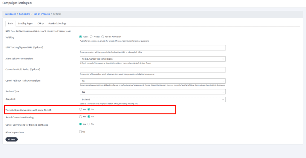
a) We Moved From Tabbed Navigation to Left-Hand Side Navigation
This is better in terms of usability, you get lots of horizontal space and more menu elements, making navigation Clear and standardizing the Actions
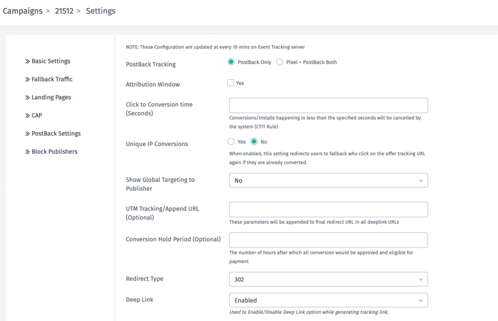
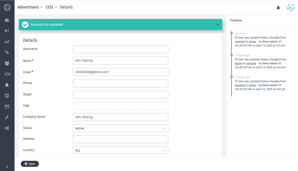
b) We Switched to a Three-Column Layout
Three column layout was used to show more info regarding the resource like the changes done on that resource or how to use a that particular resource
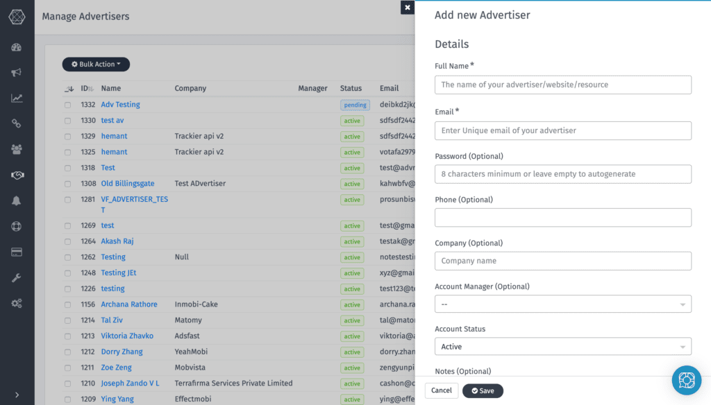
c) We Spiced Up Our Forms
We believe that when a user needs to get something done in your app, make the experience seem as linear as possible. This means that you have to contextualize each and every “side-task” involved in the process, and not send them off to separate screens.
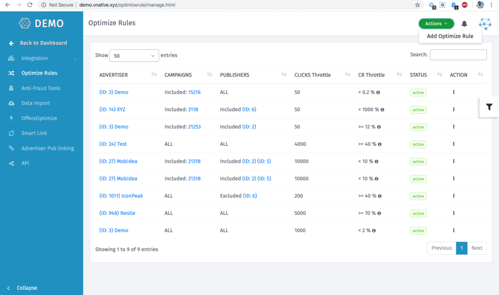
New Features
We are working on Launching Automation which will help our Tracking Customers to Automate 80% of their Campaigns Performance and Operations.
We’ll be rolling out another update in next few months and we are excited to share it with you. We would want you to help us shape the future by sharing your feedback.
All of the above has been a long time coming. We’re excited to finally share it with you. Thank you for using Trackier.
See until the next product update…
